Dr. Zigs App
An app that aims to instruct users how to use Dr. Zigs unique bubble kit and build a community for its users.
CONTEXT
An eco-friendly bubble company, Dr. Zigs, reached out to my team and me to create an app that would help build a community among their customers while teaching them how to use their unique bubble kits to make their perfect bubbles. Working with a team of five designers and our sponsor, Dr. Zigs, we designed an app that instructs and supports users in engaging with Dr. Zigs products.
MY CONTRIBUTIONS
I worked as the UI/UX Designer with 4 other teammates (PM, Project Design Lead, Research / Technical Product Lead, Research and Strategy Lead). I conducted user interviews, usability testings, collected and summarized findings, and worked more specifically on the "tutorials" page for the design.
USERS
Before diving into making the product, we want to understand what our stakeholder, Dr. Zigs, and their customers need. So, we conducted preliminary research on the users.
Dr Zigs is a sustainability-focused mid to high-end bubble toy brand, and its customers are usually environmentally-minded moms who are 28 - 45 years old with kids from 3 - 12 years old.
Through User Interviews and looking at the customer's life and relationships, we came up with these two user personas:

Parent Group

Children Group
THE PROBLEM
After we understood who we are designing for, we needed to understand what Dr. Zigs customers need. We distributed questionnaires on Instagram through Dr Zigs’ account and conducted user interviews with parents and children to gain a better understanding of the frustrations they might face and how many people face similar problems.

Questionnaire & Interview Notes
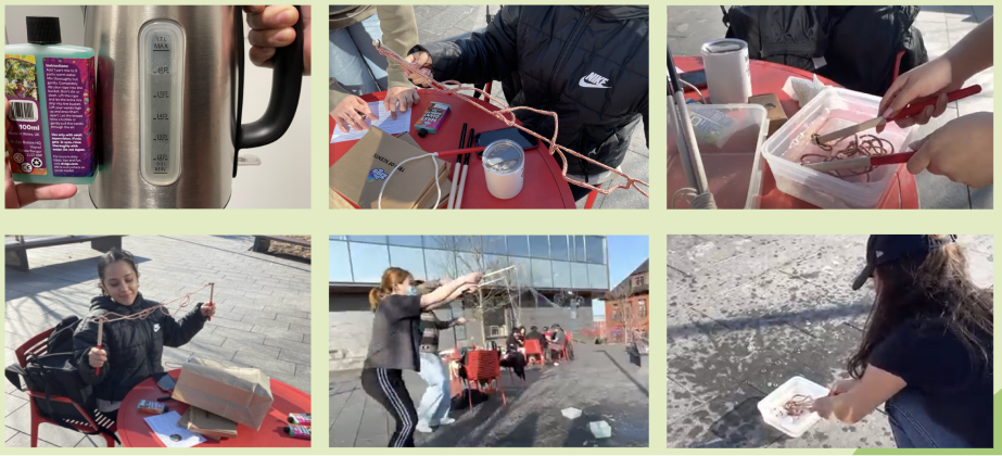
We also conducted observation and task-analysis to better understand the process of using Dr. Zigs’ bubble kits and which part of the process users are frustrated with. We provided the bubble kit to parents, watched them play with their kids, and asked follow-up questions.

Observation & Task Analysis

Task & Risk Analysis Findings
Here are 3 key frustrations we found across our findings:
1. While parents indicated that they are willing to buy more eco-friendly products for their kids, they often could not find convincing information regarding the product’s environmental impact.
2. Parents had trouble finding out how to use Dr Zigs’ bubble wand for the first time, and taking care of their kids at the same time made the bubble-making experience even more difficult.
3. Parents have a desire, but finds it hard, to make friends with other parents and be part of a community
THE SOLUTION
Through user interviews, surveys, and task-analysis, we made sure our app includes:
1. Dr. Zigs’s eco footprints through statistics
2. Instructions on how to use their unique bubble making kit
3. Community section to connect families with similar interests
IDEATION
Competitions and Design Inspirations
Before diving into designing the app, we wanted to look at apps of other sustainable brands, how-to apps for toys, as well as popular family apps for inspiration. The main inspirations for us are Patagonia and Lego.

Competitions & Inspirations
User Flow / Features
After research, we came up with a list of features required for this app. We then created a user flowchart and mood board to ensure the flow of the app is intuitive and the look of the app is matches Dr. Zigs’ branding. Dr. Zigs loves the look and mission of Patagonia, so we took some inspirations from them for the mood board.

User Needs to Functional Requirements

User Flow

Mood Board
Sketches, Wireframes, Low-fidelity Prototype
After speaking with our stakeholder, we began sketching out the low-fidelity prototype on paper and on Figma. We used the crazy-8 method, sketching 1 minute on each frame to generate ideas quickly and come up with a variety of solutions to the problem.

Crazy-8 & Wireframes
IDEA VALIDATION
After having these ideas for features and some sketches, we presented them to our professor, our stakeholder, and our classmates. They gave us a lot of advice in which we organized it into categories and identified key problems we should solve with the interest of our time and resources.

Design Feedback
1ST ITERATION
Based on the feedback given, we created a first iteration of our app.

Profile Page (Teammate 1) & Tutorial Page (Jessie)

Home Page (Teammate 2) & Community Page (Teammate 3)

Sign-Up Page (Teammate 5)
USABILITY TESTING
To see how users might interact with our app and to see how well our design works as they complete tasks, we recruited 5 participants to perform specific tasks and conduct a quick user interview at the end. The participants are Tufts students and parents, ranging from the age of 18-50.

Conducting Usability Testing

Usability Testing Findings

Usability Testing Key Insights
2ND ITERATION
Here are our final designs based on our usability testings:
REFLECTION
Collaborating with my team and our client, Dr. Zigs, allowed me to apply my skills in user research, design thinking, and prototyping to create a product that addresses real user needs.
One of the key learnings for me was the importance of thorough user research. By conducting interviews, surveys, and task analyses, we were able to gain valuable insights into the frustrations and needs of Dr. Zigs' customers. This research informed our design decisions and ensured that the app would truly meet the users' needs.
Another important aspect of this project was the iterative design process. We continuously gathered feedback from stakeholders, professors, and users, which helped us refine our designs and make informed decisions. This process taught me to that design takes several iterations, and the importance of incorporating feedback into the design process.
